-
↑
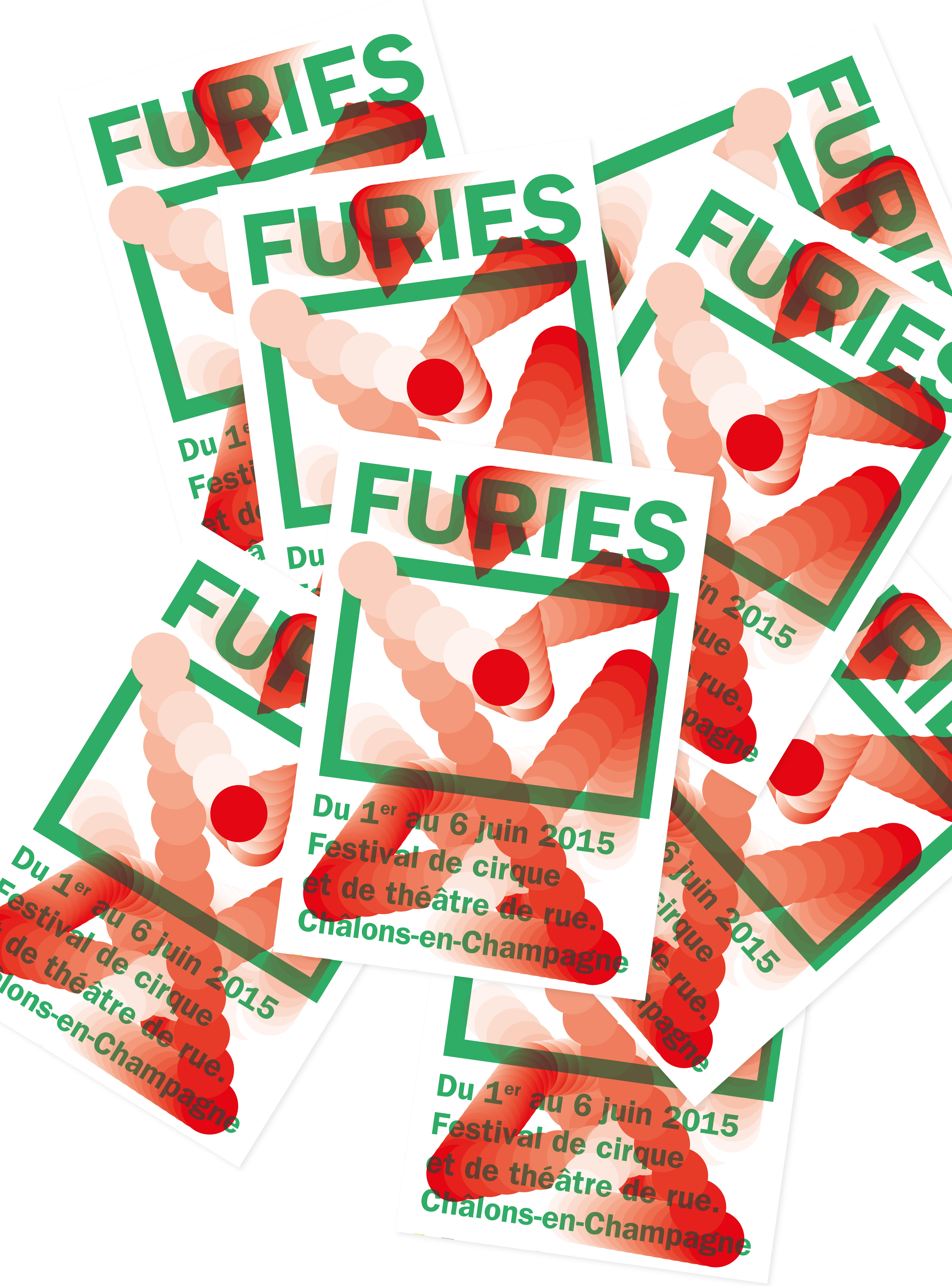
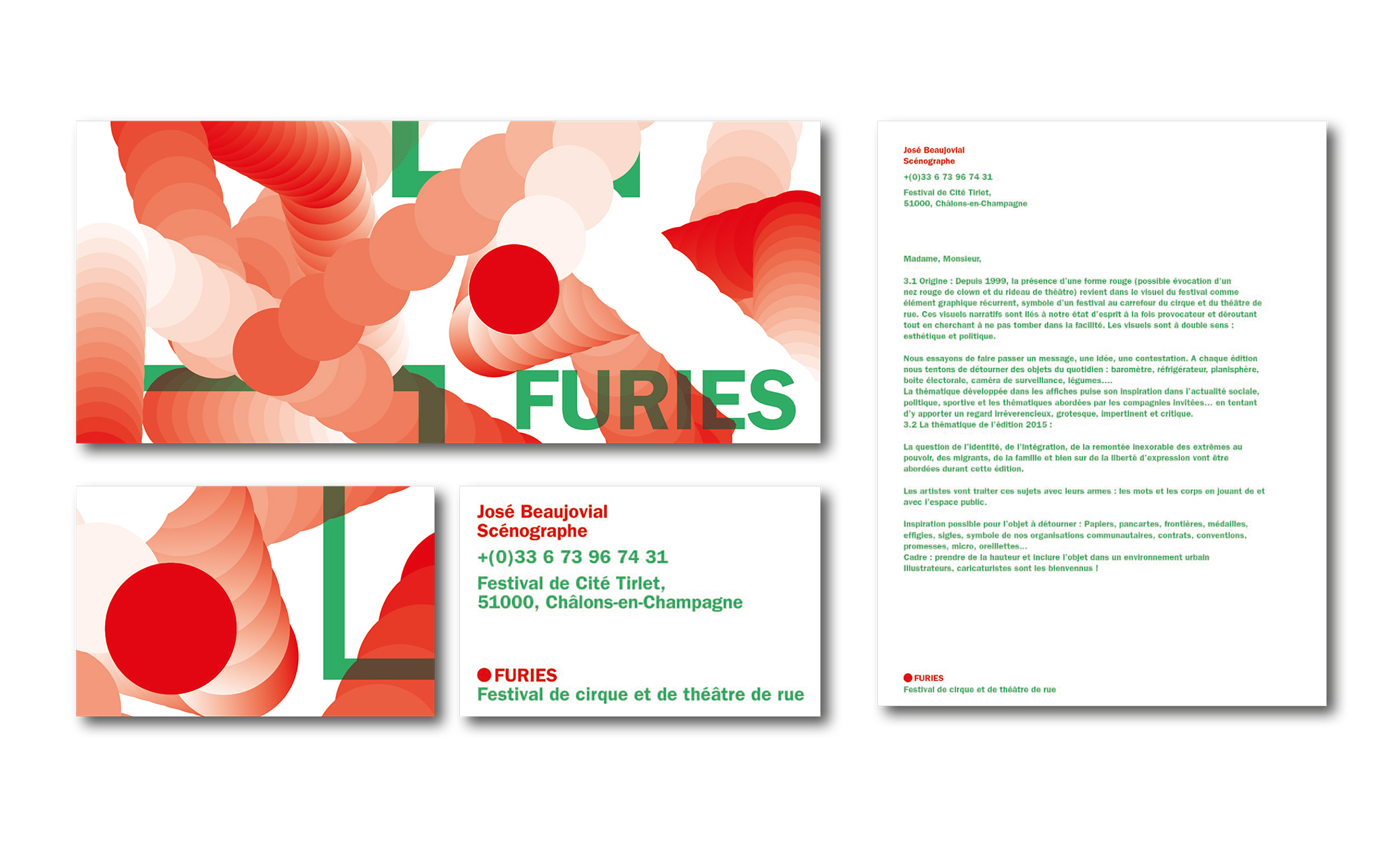
FURIES
FURIES is a circus and street theatre festival in Châlon-sur-Saône (France). The main topics of the event were: freedom of expression, national identity, migration, etc. The festival tasked us to create a new poster with a provocative, disturbing and aesthetic visual. In addition, one element was unmissable: a RED FORM, symbol of the clown and the theatre's curtains.
We have designed the main poster which played with a moving red ball confronted with the limits of its frame and tried to go beyond the limits imposed. Breaking the barriers of conventions and getting out of the established frameworks are essential values to FURIES. Then, to allude to freedom of expression, permanent questioning and thanks to simple forms, with bright colours, frames and rebounds, we developed graphic variations on different formats and supports.
Collaboration avec Pierre CONSTANTIN
-
↑
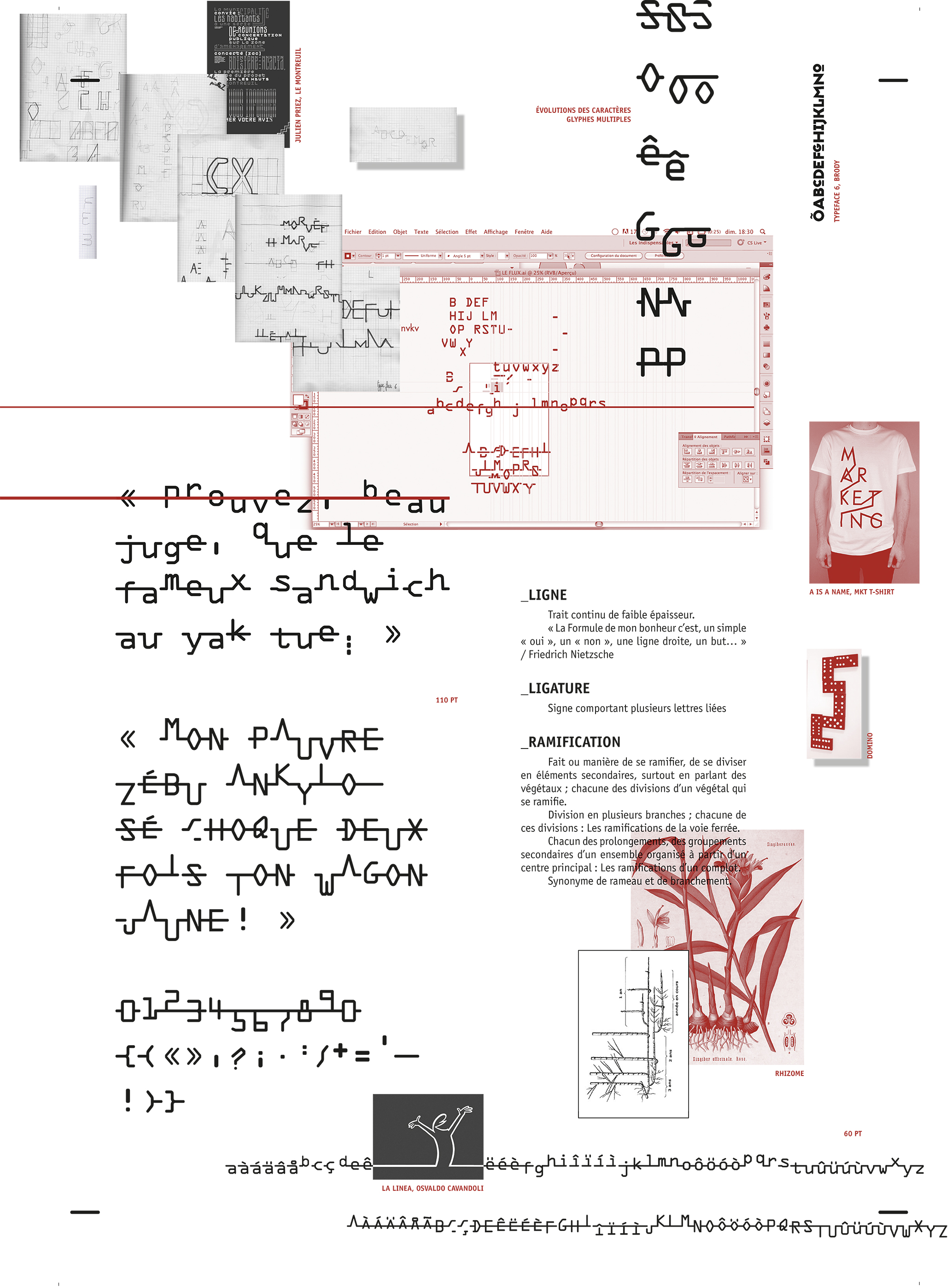
LA LIGATYPE
The challenge of this project was to develop a font which alludes to the “flow”. Starting from the font OCR-A, I have played with the ligatures, the ramification, the line and I have finally designed “La Ligatype”. All the letters are linked together to make ligature-words.
-
↑
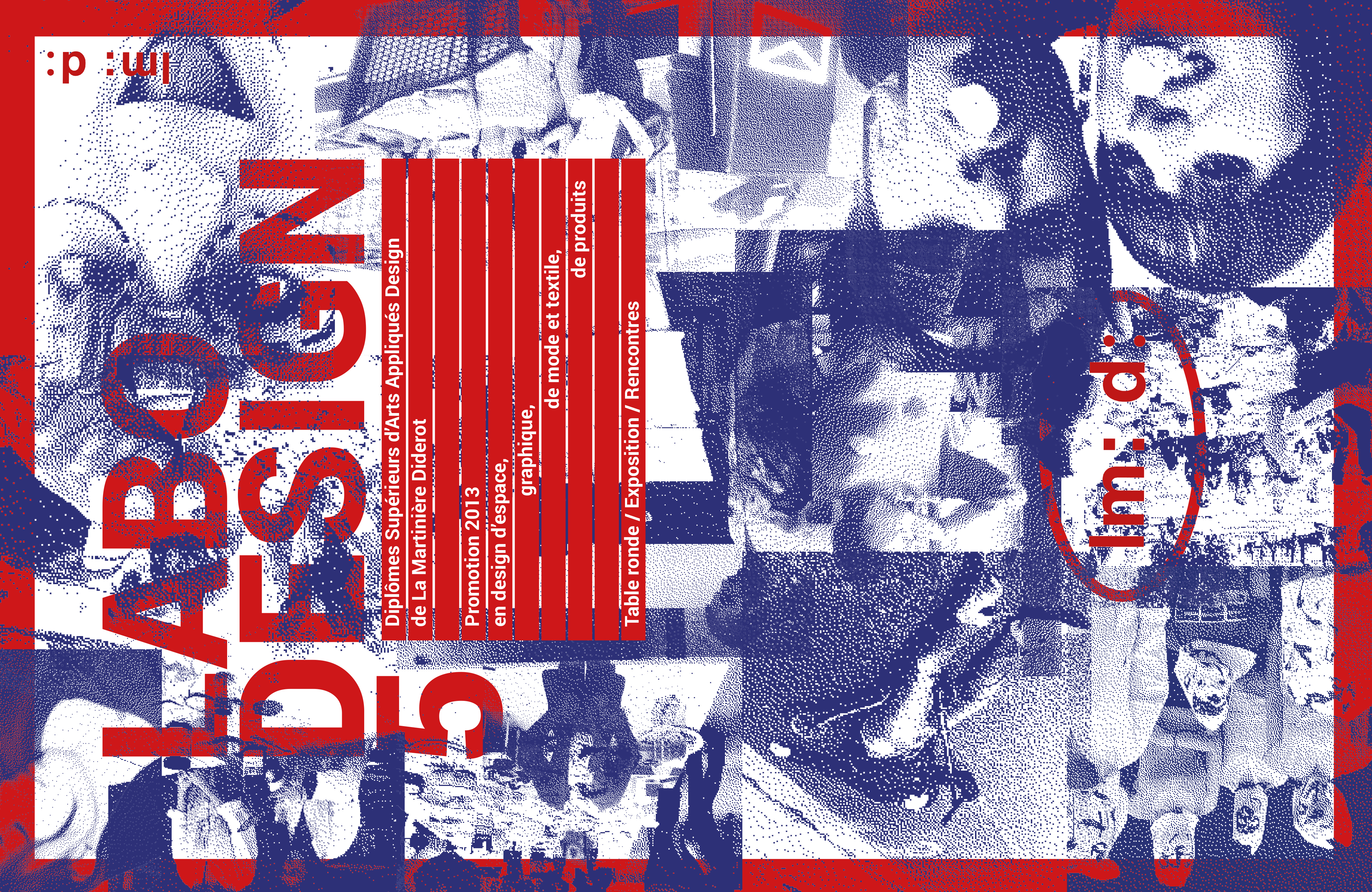
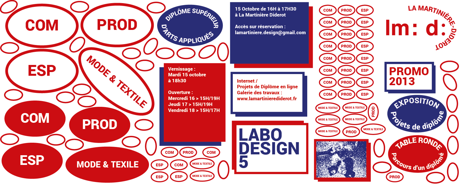
LABO DESIGN 5
LABO DESIGN 5 was an exhibition about subjective and committed practices of design. These practices were illustrated through the projects of the graduated students of the Higher Diploma of Applied Arts of the design school La Martinière-Diderot (Lyon, France). A global visual identity linked the scenography and the catalog of the exhibition.
“As all innovative fields, the Design is in perpetual mutation. Think about the future of this discipline, this is also worrying about the user”. This is the concept we developed for the visual identity of this event. Through simple graphic vocabulary, the identity of the exhibition had a strong impact and keep an important place to the human-user-colleague-friend.
Collaboration avec Pierre CONSTANTIN
-
↑
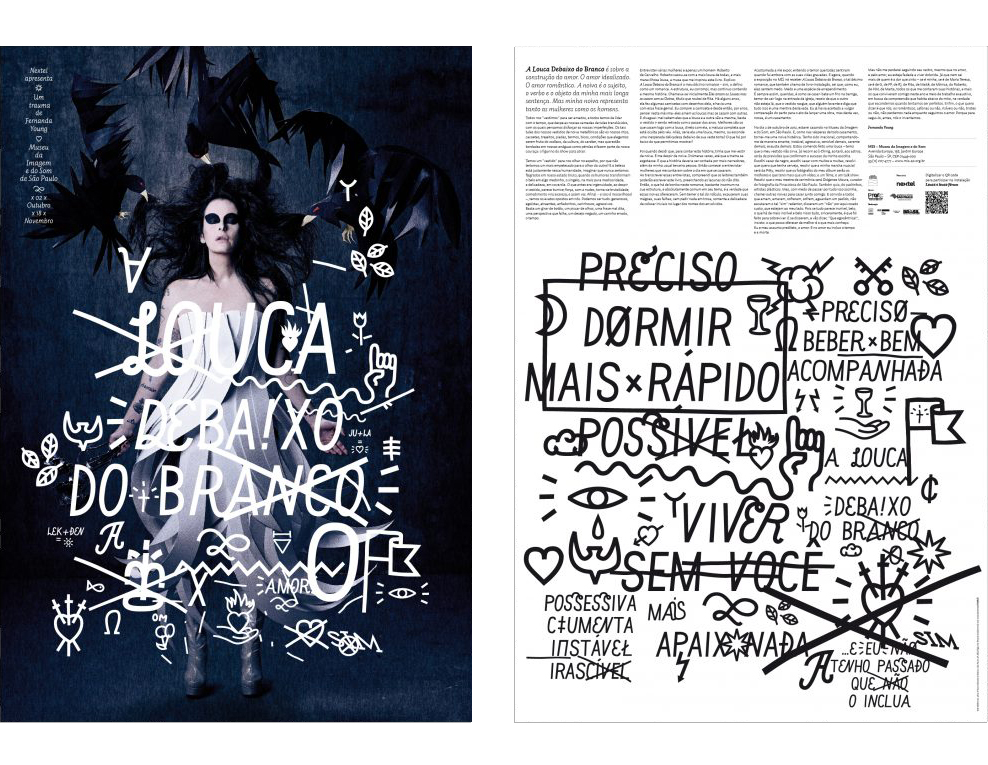
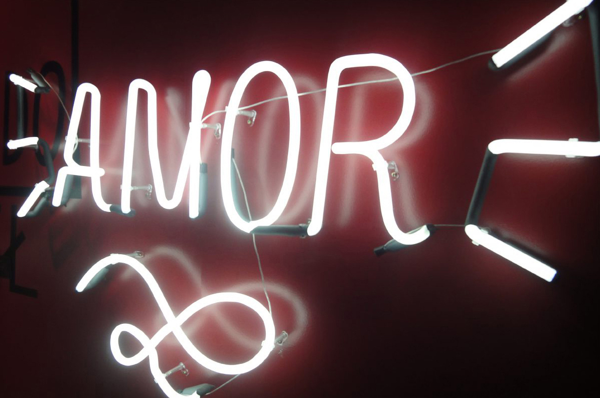
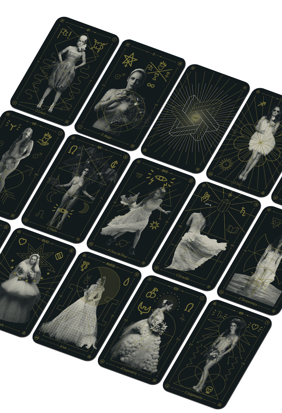
A LOUCA DEBAIXO DO BRANCO
“A Louca debaixo do Branco: um trauma de Fernanda Young” was an exhibition of the Brazilian artist Fernanda YOUNG at the Museu da Imagem e do Som (MIS) in São Paulo.
I got involved in the process of graphic scenography in accordance with a strong visual identity. In addition, inspired by the graphic vocabulary of the event, I developed a tarot game based on the traditional Tarot de Marseille. The symbolism and the sense of each card have been represented by pictograms, geometric shapes, and representation of the artist.
Courtesy of © A louca debaixo do branco, Fernanda YOUNG — Regular Switch
-
↑
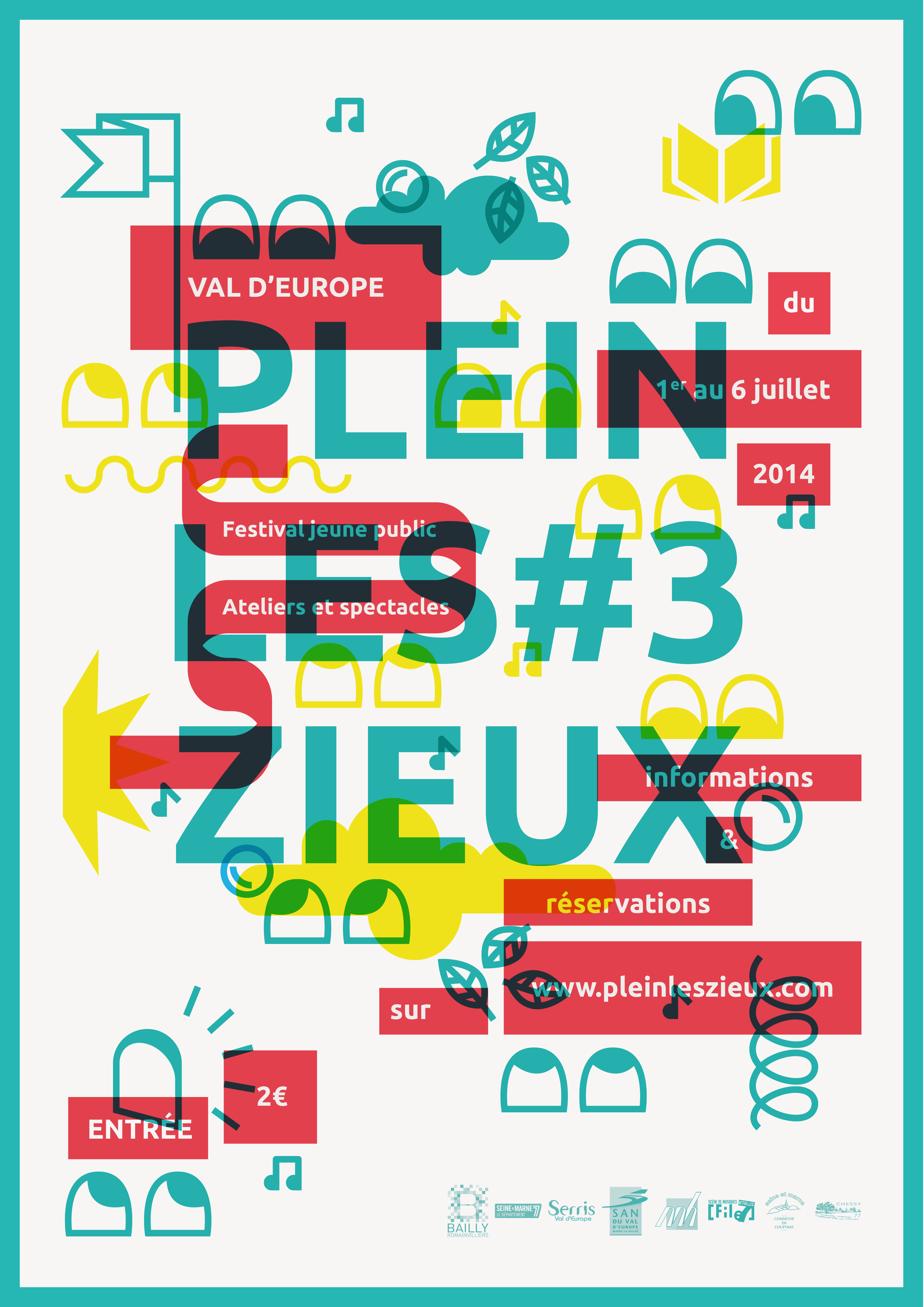
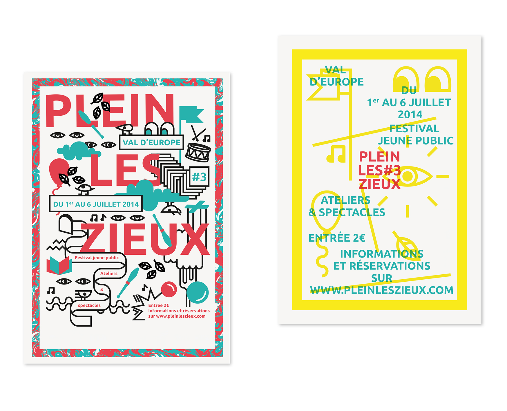
PLEIN LES ZIEUX
PLEIN LES ZIEUX (PLZ) is a festival which organises every summer, concerts and shows for children in Marne-la-Vallée (France). The issues of the festival are a diversity of shows, a friendliness place where it is good to meet people and to dream.
Through an artistic approach where the serious combines the fun and where imagination allows us to travel in different visual universes, we have developed a graphic vocabulary to create a range of innovative posters. This vocabulary has been inspired by music, shows, tales, nature.
Collaboration avec Pierre CONSTANTIN
-
↑
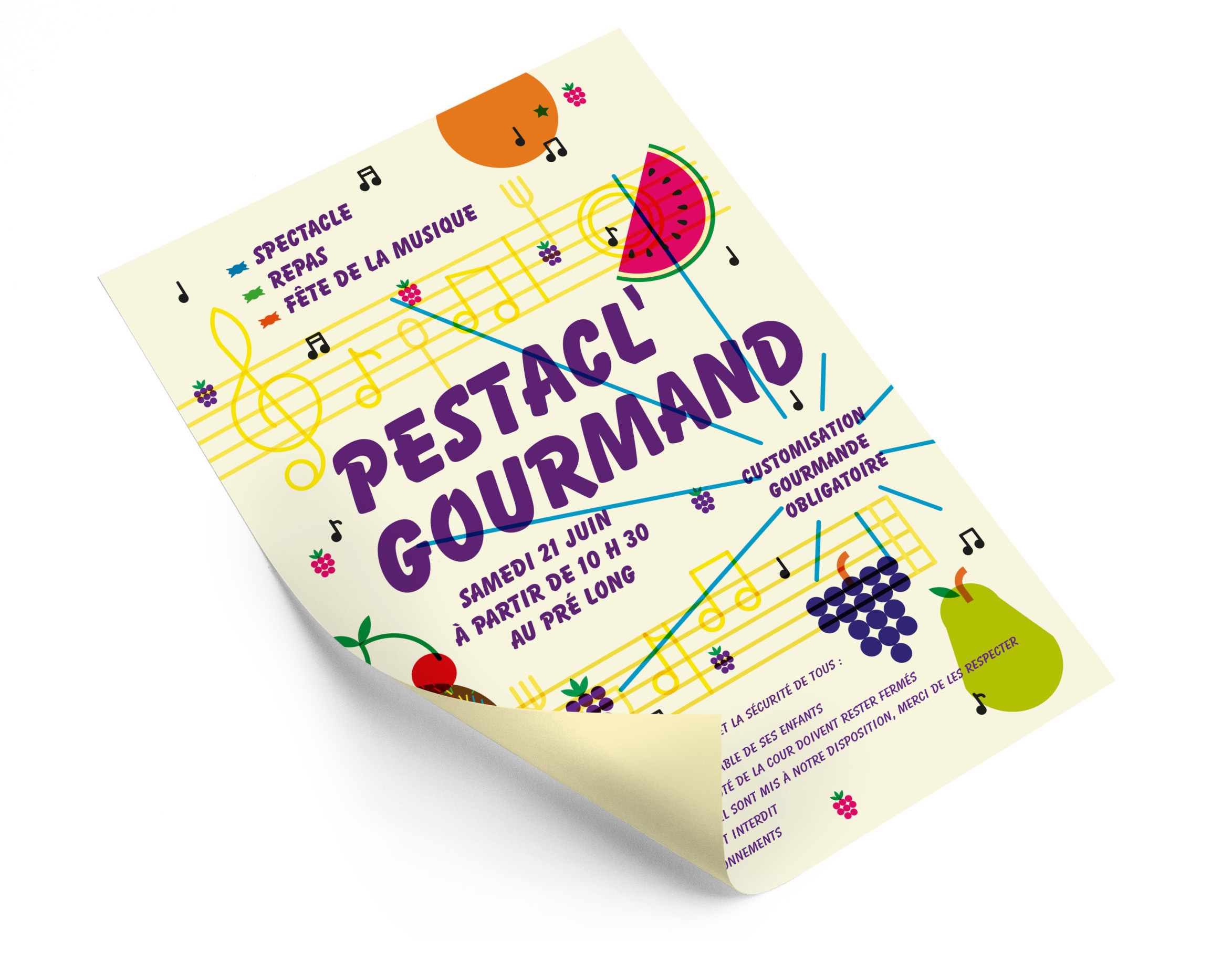
PESTACL' GOURMAND
Creation of a poster for a summer event called “PESTACL' GOURMAND” which brings together shows, food and the World Music Day. I created a graphic vocabulary which illustrate the music universe, the food and sweets for this event for young audience.