

-
↑
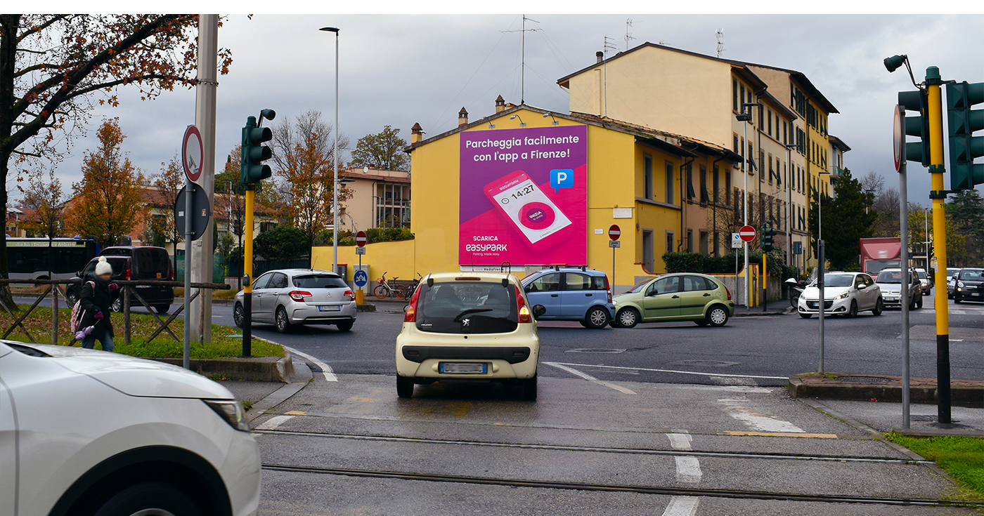
EASYPARK GROUP — Signage and Art Direction
EasyPark is a Swedish company developing a mobile app that helps you to manage your parking in more than 15 countries in Europe. To acquire every day new customer, I was working on the production of signage products deployed in the cities where the app was available. Using the graphic guidelines of the brand, within the Marketing team, and in collaboration with the Distribution teams, I developed a wide range of products adapted to every market.
The main aspects of the communication were based on a strong visual impact whenever we used a simple sticker on a parking machine or a big banner in the city and be focused on the main advantages of using the app compared using a parking meter: to pay only for the exact time you park, manage your parking with your mobile, no need to have a ticket anymore, etc.
Courtesy of © EasyPark Group

-
↑
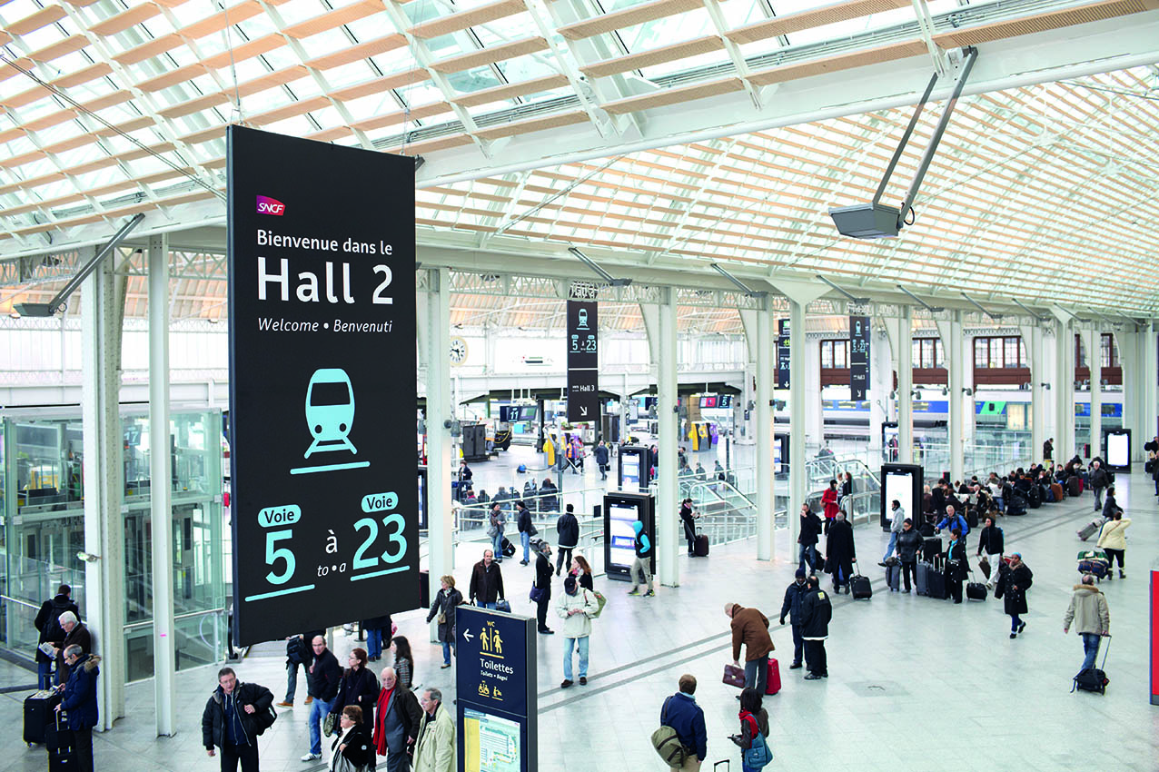
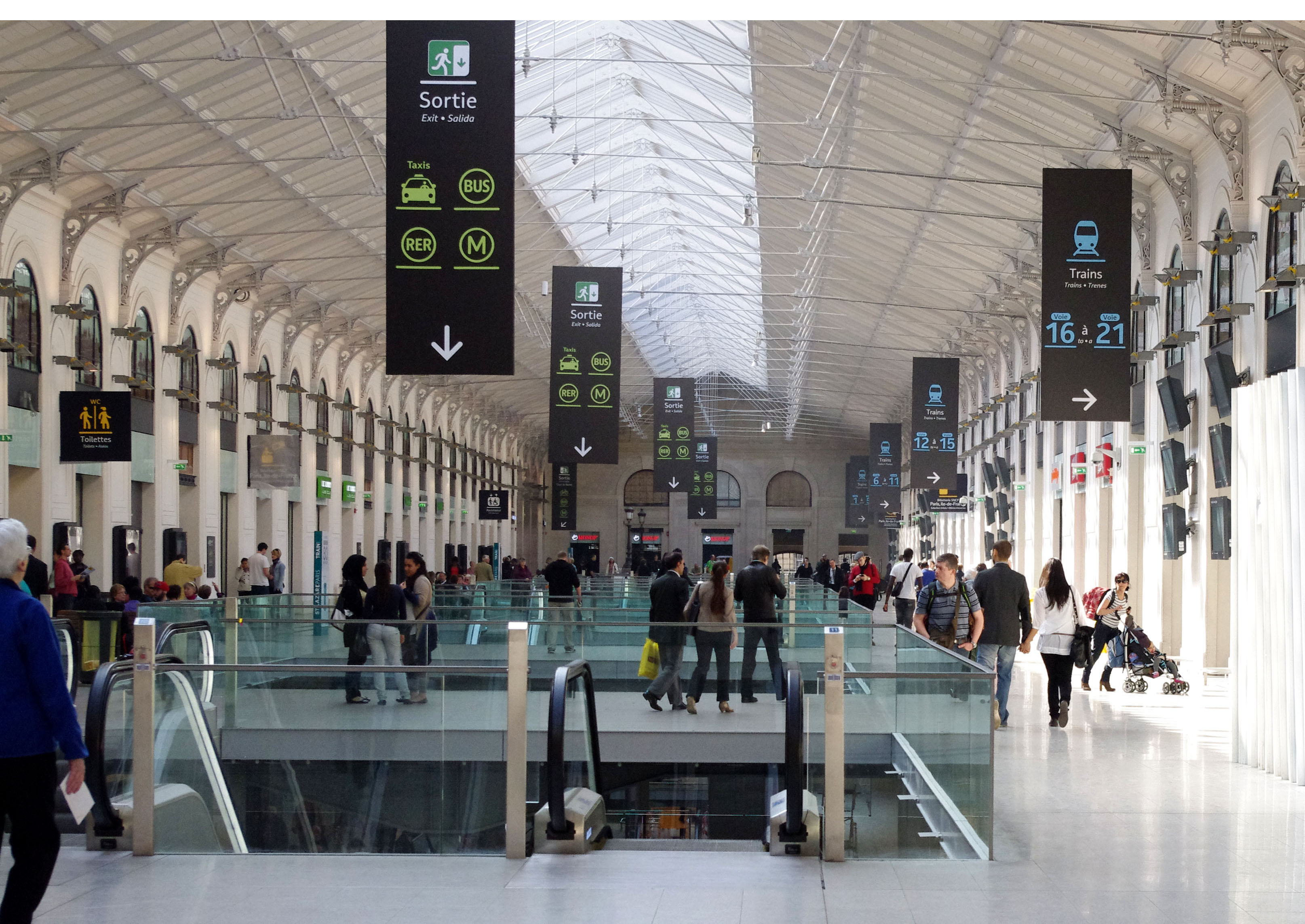
ORIENTATION IN SNCF TRAIN STATIONS — Signage in public spaces
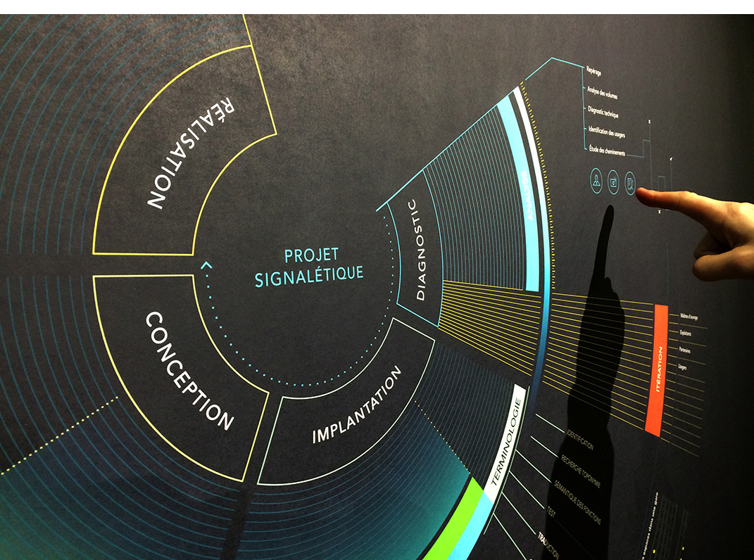
Each signage project follows 4 different steps which are the diagnostic, the implantation, the conception, and the realization: from the analysis of the ground plan to the production of the signs. Within AREP which is the biggest French architecture company and an SNCF's branch, I was working in the “designlab” on signage projects for SNCF train stations. Working on the design of a sign or on the animated visual of a digital display was part of my job. Our main objective was to allow passengers and users to orientate themselves intuitively within the public spaces.
Courtesy of © M. VIGNEAU and Y. AUDIC — SNCF Gares & Connections — AREP designlab
-
↑
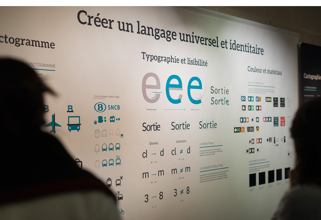
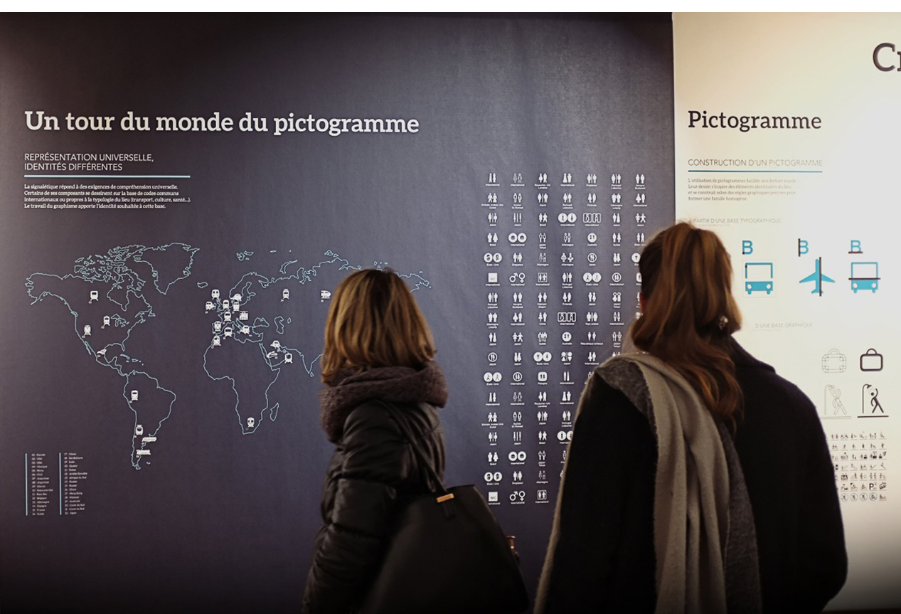
WAYFINDING IN PUBLIC SPACE — Graphic design and Scenography
At the Musée des Arts Décoratifs in Paris, through an immersive exhibition, AREP design lab invited visitors to discover the different forms of signage and the significant work necessary in order to allow users to orientate themselves intuitively.
With a team of designers and graphic designers, we developed several posters about different subjects: typography, legibility, colours and materials, pictograms, cartography… to explain that all public spaces are used by the user-passenger and integrate a particular wayfinding strategy. Besides, two installations allow visitors to watch signage through a partially-sighted person's vision to be aware of the colour and typography work.
Courtesy of © Yann AUDIC — AREP designlab
-
↑
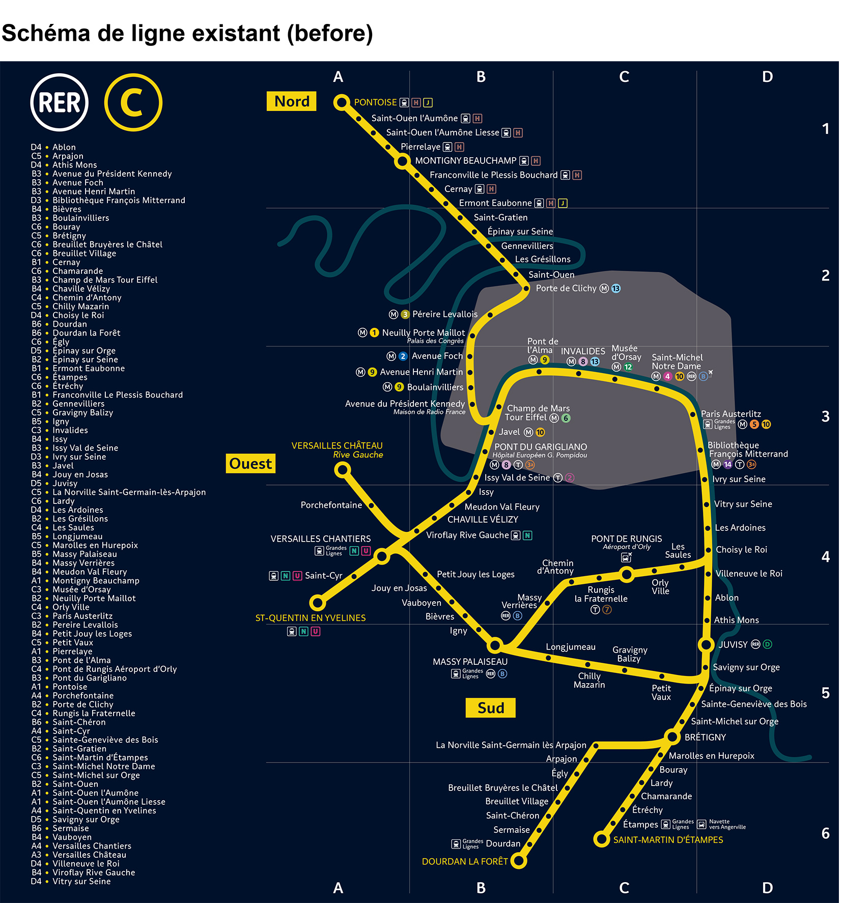
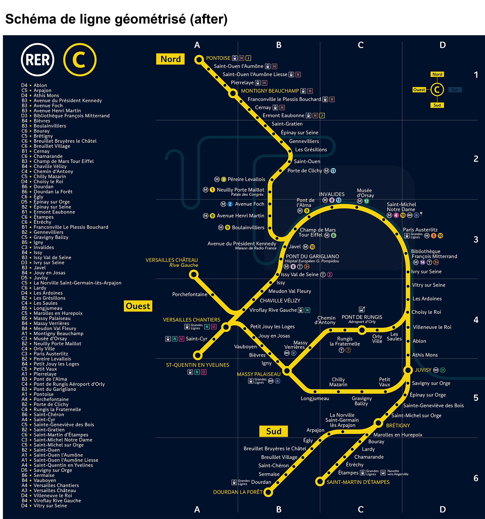
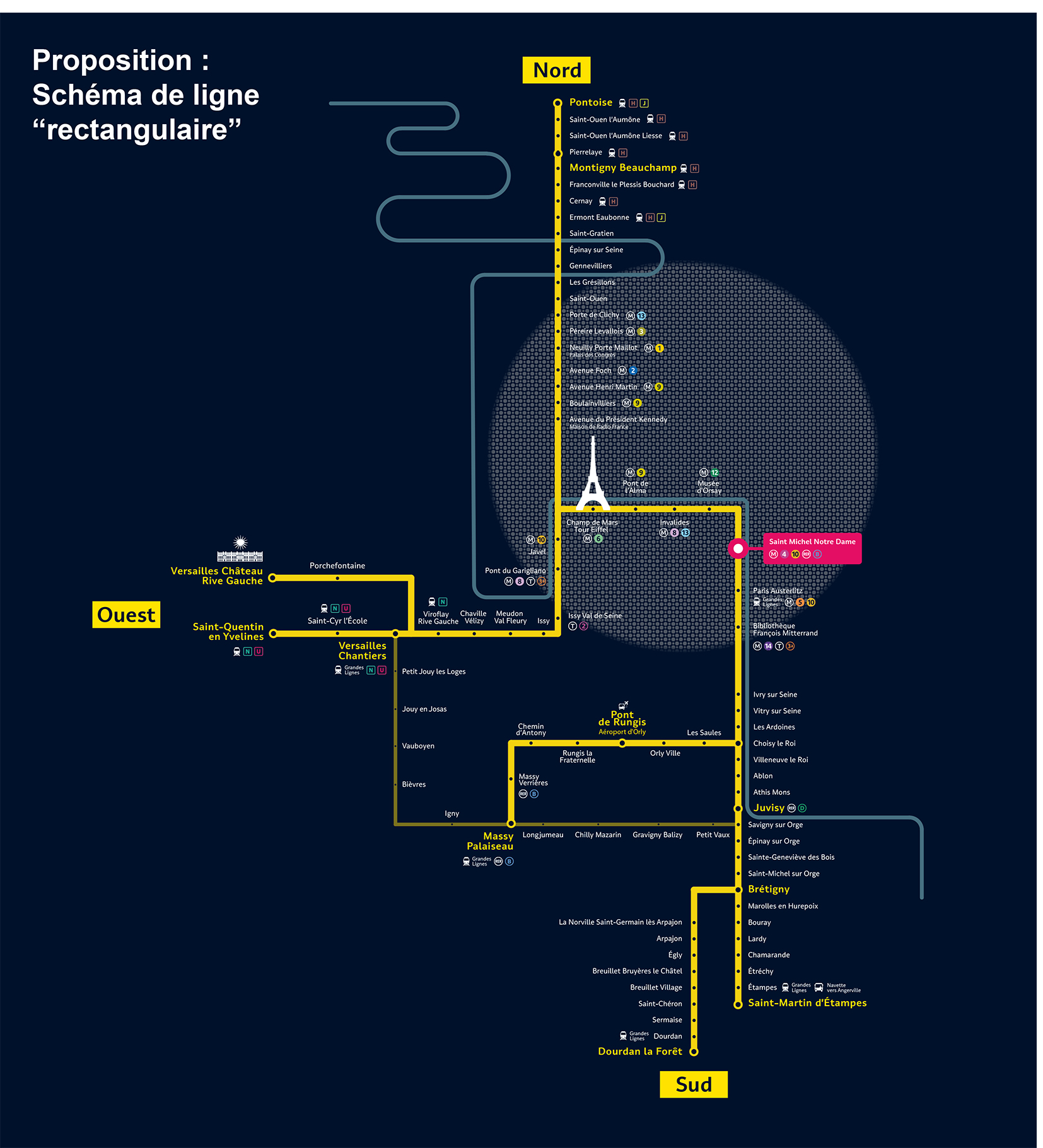
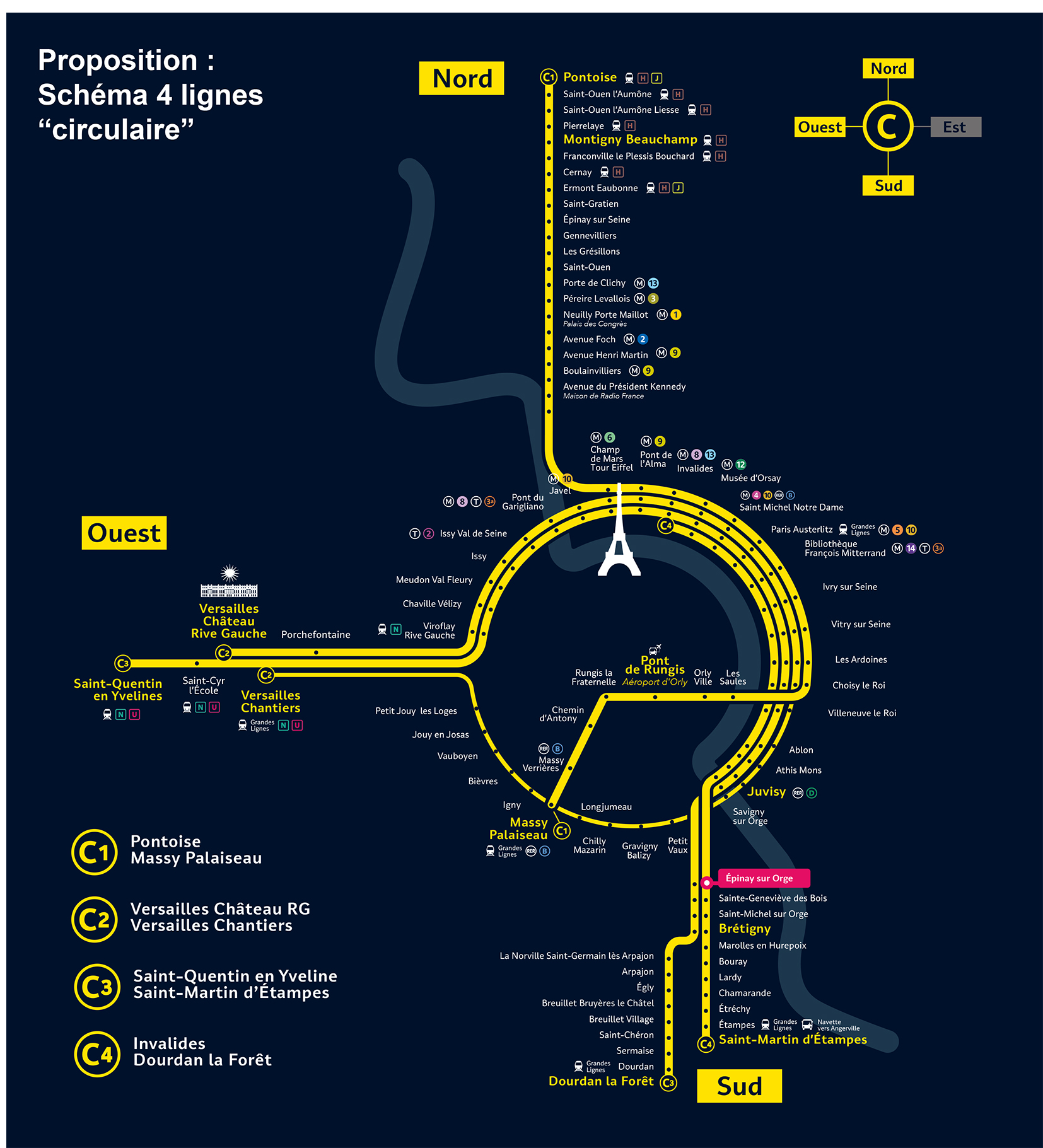
RER C EXPERIMENTATIONS — Signage in public spaces
The RER C line is one on the RER Parisian public transportation network and used by millions of people and tourists every year because it brings to the Château de Versailles, to the Eiffel Tower, or to Orly airport (Pont de Rungis). However, the route of the line is pretty complicated to understand for the users because of different departures and arrivals stations. Indeed, the RER C line is not only one line but 4 different ones. The goal of the work was to redesign the diagram of the line to make it more simple and efficient to read and understand.
Courtesy of © SNCF Gares & Connexions — AREP designlab
-
↑
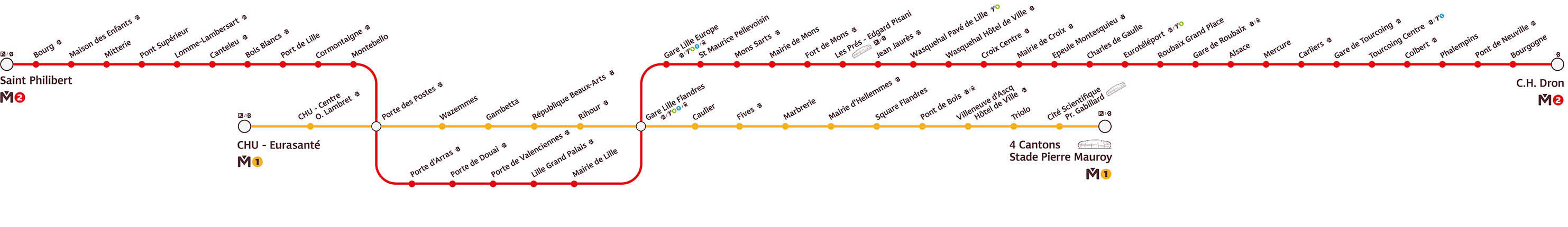
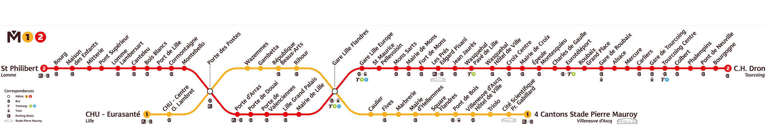
TOULOUSE'S METRO — Diagram design (before and after)
With the coming new metro in the city of Toulouse (France), the whole communication of the public transportation network was up to date. Here, my job was to redesign the diagram design of the Toulouse's metro with 2 lines. The main objective: make a diagram design more visual and easy to understand.
© Réseau Transpole — AREP designlab